Trial Illustration: How to Choose, Build, and Defend One
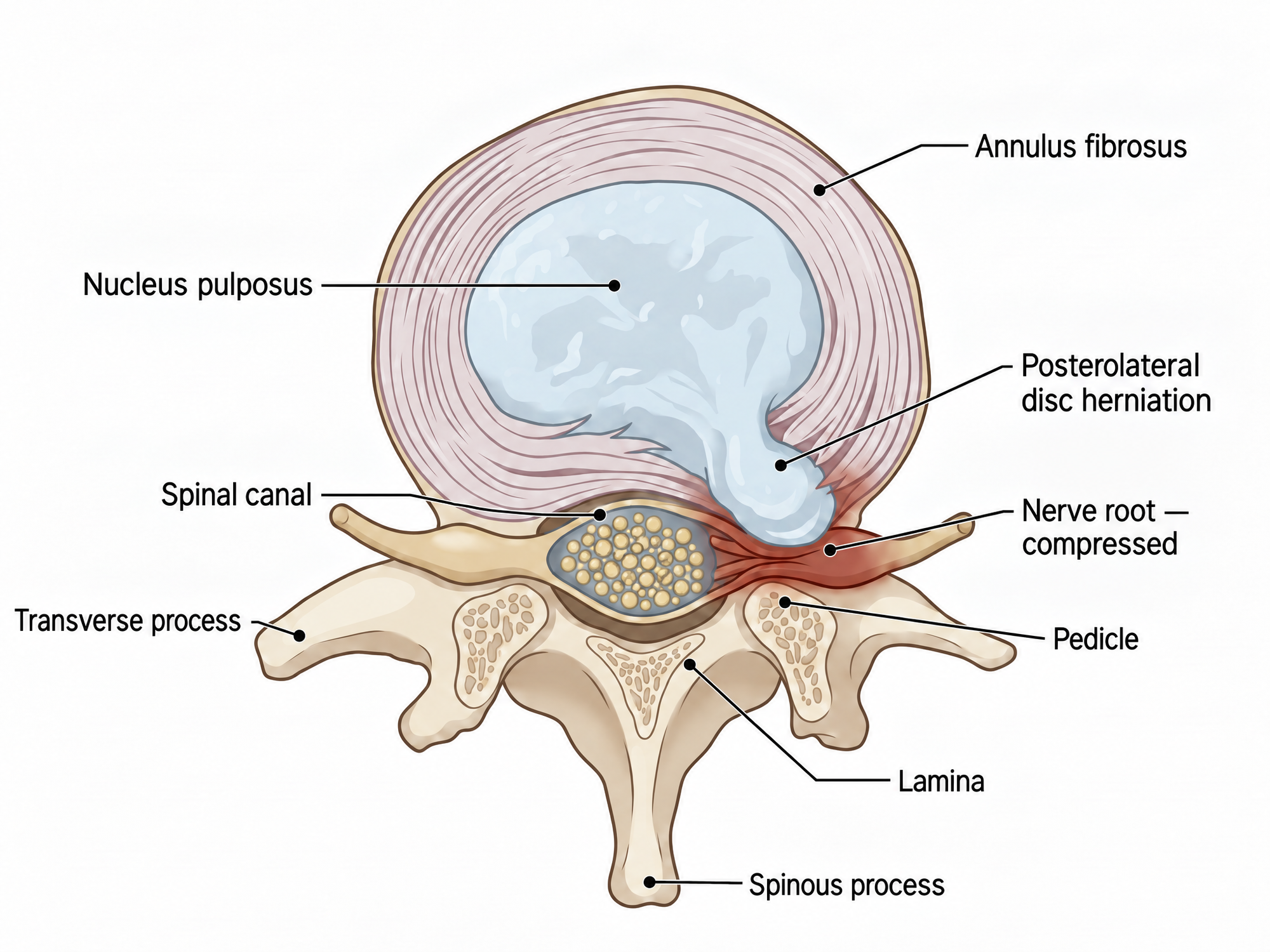 A labeled illustration of a posterolateral L4-L5 disc herniation compressing the nerve root, showing the annulus fibrosus, nucleus pulposus, spinal canal, and surrounding vertebral anatomy.
The orthopedic surgeon on the stand knows exactly what the MRI shows: a paracentral L4-L5 herniation contacting the descending L5 root. The jury hears "paracentral," "L4-L5," and "descending root" and retains three unfamiliar words. A trial illustration is what turns that sentence into something twelve people can see, remember, and carry into deliberation.
This guide is for attorneys and litigation staff who need to commission or produce one. It covers five common formats for a medical trial illustration, the conventions that can help an illustration withstand challenge, how to build one from the record, and where the process goes wrong. For the wider category of visual exhibits (timelines, damages charts, colorized imaging, animation), see the guide to trial graphics.
What a Trial Illustration Is
A trial illustration is a custom drawing prepared from a case's evidence to help a factfinder understand testimony. In personal-injury and medical-malpractice work it is often anatomical: the plaintiff's injury, the surgery that repaired it, the structure allegedly damaged, or the normal anatomy needed to understand the medical issues.
Legally, the classification depends on how the illustration is offered and used. An illustration used only to help the factfinder understand evidence or argument is an illustrative aid under Federal Rule of Evidence 107, not evidence. An illustration offered to prove a disputed fact may instead be demonstrative evidence, subject to the applicable requirements for admission. A case-specific medical illustration should not state a conclusion beyond the supporting evidence and expert opinion.
Under Rule 107, an illustrative aid ordinarily does not go to the jury room unless all parties consent or the court finds good cause. When practicable, an aid used at trial must be entered into the record. These are federal rules; state evidence rules and courtroom procedures may differ. Current Federal Rules of Evidence.
The term is sometimes confused with courtroom sketching, the press artist's drawing of proceedings where cameras are barred. The Library of Congress holds an 1859 illustration of John Brown's trial, but courtroom sketching is journalism, not evidence.
Start With the One Sentence
The most common failure in trial illustration is deciding the format before deciding the message. Before briefing anyone, write the takeaway as a single sentence:
- "The impact tore the anterior cruciate ligament and fractured the lateral tibial plateau."
- "The surgeon placed the pedicle screw through the medial wall and into the canal."
- "The herniation at L5-S1 is new; the degenerative changes at L4-L5 are old."
That sentence helps determine the format. The first could become a mechanism-plus-injury illustration if supported by qualified medical testimony. The second could become a surgical-step comparison against the technique described by the expert. The third could become a before-and-after comparison. If the sentence contains multiple distinct propositions, consider whether separate illustrations would be clearer.
It also helps decide what to leave out. Details that do not serve the supported proposition may create distraction or additional subjects for cross-examination.
Five Common Formats
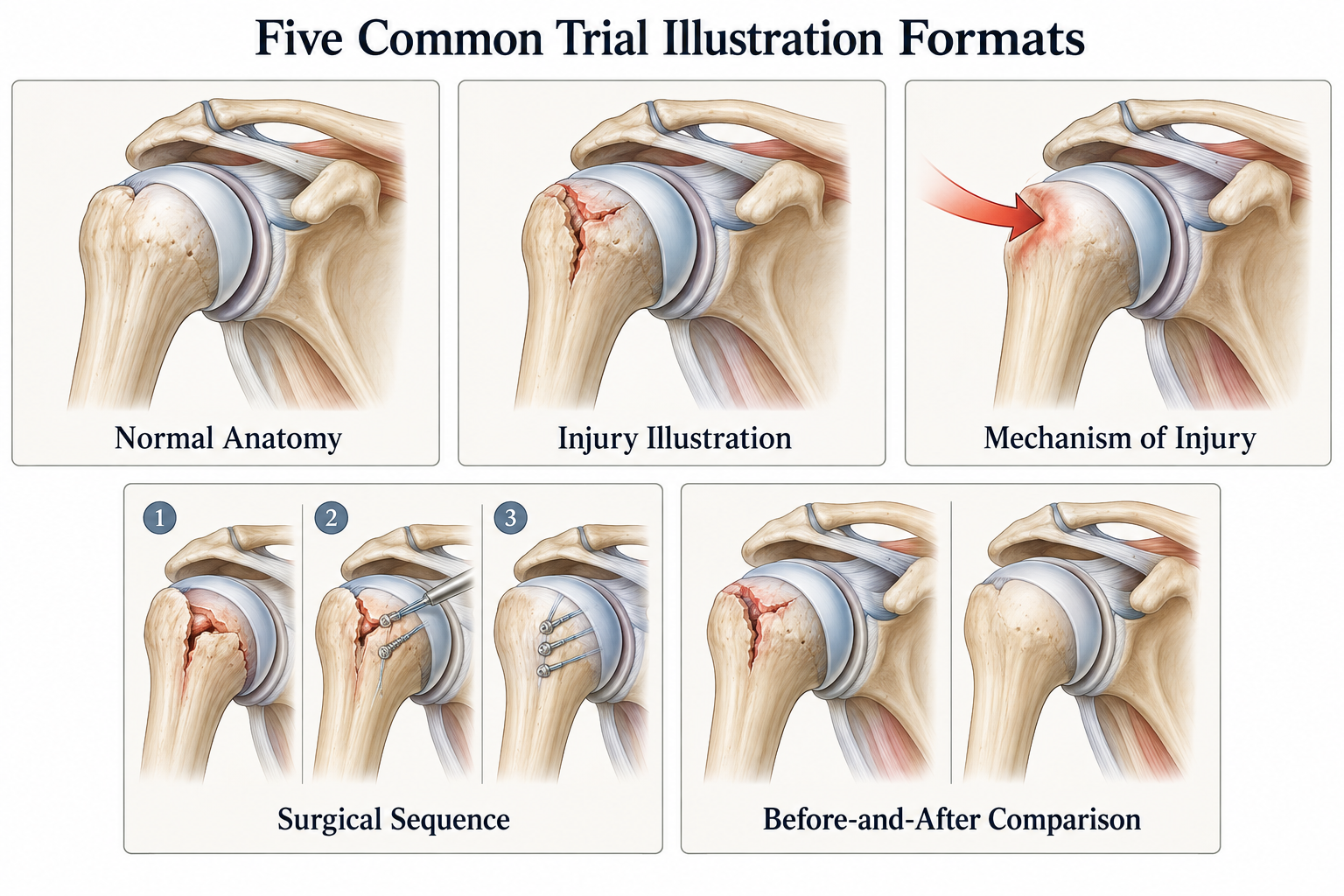 Five common trial illustration formats: normal anatomy, injury illustration, mechanism of injury, surgical sequence, and before-and-after comparison, each shown as a labeled shoulder anatomy panel.
1. Normal anatomy
A labeled drawing of the relevant region, uninjured. Normal-anatomy illustrations can give the factfinder a reference point before a witness discusses an injury or procedure. They may be generic when used only to explain normal anatomy, provided they are not represented as depicting the patient's specific anatomy.
2. Injury illustration
The plaintiff's specific injury as documented: the level, side, and structure supported by imaging, medical records, and expert opinion. A generic textbook illustration can properly explain normal anatomy or a general medical concept, but it should not be represented as a patient-specific depiction.
3. Mechanism of injury
How force allegedly traveled to produce the injury. A mechanism illustration may connect an event to an injury, but that causal sequence must be supported by admissible evidence and a qualified expert opinion when specialized knowledge is required. The illustration should explain the opinion rather than supply a causation conclusion that the witness has not reached.
4. Surgical sequence
Step-by-step frames of a procedure. This format can help in malpractice litigation when the dispute concerns what occurred during a particular stage of an operation. It can also explain the nature of a repair in an injury case, provided the sequence accurately reflects the medical record and supporting testimony.
5. Before-and-after comparison
The anatomy before an injury or procedure beside the anatomy afterward. This format can clarify a documented change over time, but the comparison must account for differences in imaging technique, orientation, positioning, and timing. It can be used with medical images or drawn anatomy when the comparison is supported by the record.
Each format is covered with examples in the medical legal illustration guide; the point here is that the format should follow the supported proposition.
Conventions That Survive Cross-Examination
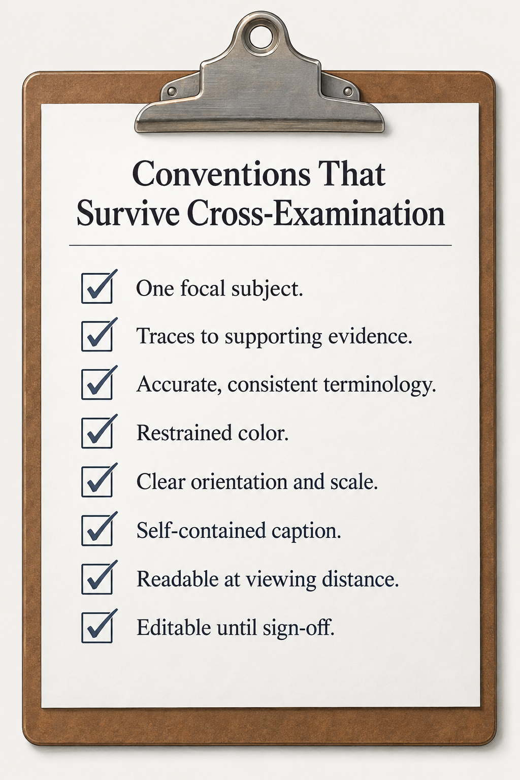 A checklist titled Conventions That Survive Cross-Examination on a clipboard, listing one focal subject, traces to supporting evidence, accurate and consistent terminology, restrained color, clear orientation and scale, self-contained caption, readable at viewing distance, and editable until sign-off.
A trial illustration may be challenged by opposing counsel or an expert and reviewed by the judge before the jury sees it. These conventions can reduce avoidable disputes.
One focal subject. The viewer should know what to look at first. Grey out or simplify everything that is not the point.
Every material element traces to supporting evidence or opinion. The level to the MRI and report. The hardware to the operative note or imaging. The laterality to the underlying study and interpretation. A source sheet can make expert review, disclosure, and examination more efficient.
Labels use accurate, consistent terminology. If the expert uses "nerve root," the illustration should not substitute a different or imprecise term. Consistency reduces confusion and makes the foundation easier to explain.
Restrained color. Color can separate structures or direct attention, but it should not imply a medical fact that the evidence does not support. For an illustrative aid, excessive or inflammatory color may weigh against use under Rule 107. If the illustration is offered as evidence, Rule 403 may also apply.
Orientation and scale are clear. Use accurate orientation markers where they help comprehension. State when an illustration is not to scale, and do not add a scale representation unless it is supported by the source material.
Self-contained caption. The illustration can state what it shows, its principal source, and any important limitation. For example: "Illustration of L4-L5 disc herniation based on MRI dated 3/14/2025. Not to scale." Identify an expert as having reviewed it only after obtaining that approval.
Readable at the distance it will be shown. Test a board or digital display from the expected viewing distance. There is no universal minimum font size because legibility depends on the physical dimensions, viewing distance, typeface, contrast, display resolution, and courtroom configuration.
Editable until sign-off. Keep layers separate (anatomy, injury, labels, callouts) so changes requested during expert review can be made efficiently.
Building One From the Record
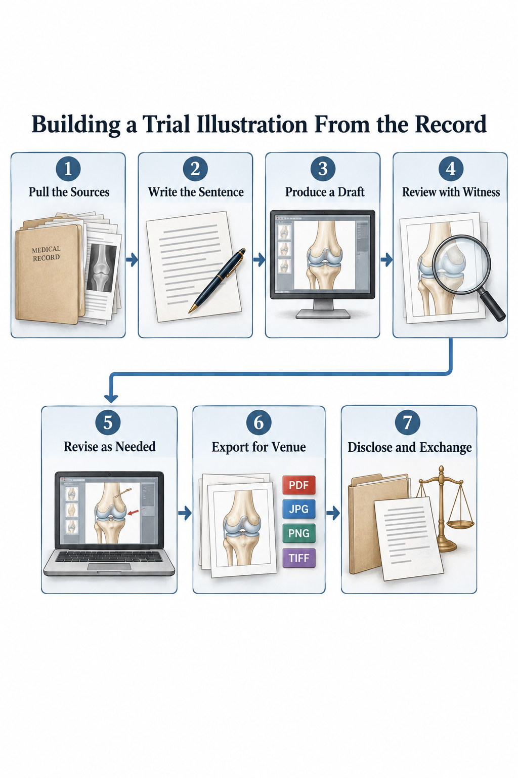 A seven-step flowchart titled Building a Trial Illustration From the Record: pull the sources, write the sentence, produce a draft, review with witness, revise as needed, export for venue, and disclose and exchange.
Whether you commission a medical illustrator or produce a draft in-house, the following is a useful workflow, subject to the needs of the case and the court's deadlines.
- Pull the sources. The imaging report and images, the operative note, the relevant pages of the expert report, and the deposition excerpts where the expert describes the anatomy.
- Write the sentence and pick the format.
- Produce a draft. Timing and price vary with complexity, source quality, revision requirements, and the provider. An AI-assisted workflow can help produce a first draft: Natomy offers tools for creating a clinical-style illustration from an operative photograph, imaging study, or existing diagram. The accuracy checker is designed to flag potential inconsistencies for human review; it does not replace review by a qualified medical professional.
- Review with the qualified witness, side by side with the source record. Remove or revise elements the witness cannot support. Document review in a manner consistent with counsel's disclosure obligations and litigation strategy; no particular approval email or form is universally sufficient.
- Revise as needed. Resolve disagreements about anatomy, terminology, orientation, scale, and the proposition being illustrated before final production.
- Export for the venue. Use the resolution, dimensions, file type, and color settings required by the printer, presentation system, pretrial order, or courtroom staff. Keep the layered source and the final version used in court.
- Disclose and exchange as required. Follow the scheduling order, local rules, expert-disclosure requirements, and pretrial order. In federal civil cases, a retained expert's report generally must identify exhibits used to summarize or support the expert's opinions, and pretrial disclosures generally must identify exhibits a party expects or may offer. Federal Rule of Civil Procedure 26. A disclosure failure can lead to exclusion or other sanctions, but Rule 37(c)(1) recognizes an exception when the failure was substantially justified or harmless.
Where It Goes Wrong
Generic anatomy presented as case-specific. A textbook drawing of a herniated disc with the plaintiff's name on it. The defense expert asks what imaging it was drawn from, and there is no answer.
Overreach. The illustration shows nerve compression as certain when the expert's opinion is "likely." Shows three levels of injury when the report documents one. Shows the surgeon's hand where no witness saw it.
Drama. Deep red, spurting vessels, or an anguished patient figure may create a dispute under Rule 107 or, for evidence, Rule 403. Use visual emphasis only when it accurately serves the supported medical point.
Vocabulary mismatch. Labels the expert would not use, or would not use that way.
The qualified witness sees it for the first time on the stand. Advance review reduces the risk of an accuracy dispute or an incomplete foundation. Build a case-specific medical illustration with input from the witness expected to support it.
Wrong format for the venue. A dense, beautifully detailed illustration that is illegible from the jury box.
AI and Provenance
Some firms produce first-draft illustrations themselves or use AI-assisted tools. Existing rules governing illustrative aids, evidence, expert testimony, authentication, and disclosure still apply. The Advisory Committee on Evidence Rules published proposed Rule 707 in 2025 to address certain machine-generated evidence offered without a human expert. In May 2026, however, the Committee declined to recommend action on the proposal at that time and continued studying a revised version. Proposed Rule 707 is not currently part of the Federal Rules of Evidence. May 2026 Advisory Committee report.
The published proposal targeted machine-generated evidence that would be subject to Rule 702 if presented as a human expert opinion and that is offered without an expert witness. It did not target an AI-created visual used only as a Rule 107 illustrative aid. Even so, counsel should verify an AI-assisted illustration against reliable source material, obtain appropriate medical review, preserve the final version, and be prepared to address its production if accuracy or reliability is challenged.
The guide to generating medical illustrations covers style and labeling choices; the guide to animations and illustrations for trial covers when a still exhibit should give way to a moving one.
Key Takeaways
- Write the one-sentence takeaway first; it decides the format and everything the exhibit leaves out.
- Every material element should trace to supporting evidence or a qualified expert opinion.
- Restrained color, clear orientation, disclosed scale limitations, and terminology consistent with the testimony can reduce avoidable objections.
- Review a case-specific medical illustration with the qualified witness and satisfy the applicable disclosure requirements.
- AI assistance does not replace source verification, medical review, or compliance with the court's rules and orders.
FAQ
What is a trial illustration?+
A trial illustration is a custom litigation visual, usually an anatomical drawing, surgical sequence, or annotated image, prepared to help a judge or jury understand evidence, testimony, or argument. In injury and malpractice litigation it often depicts anatomy, an injury, or a procedure documented in imaging, medical records, or expert opinion. Depending on how it is offered and used, it may be an illustrative aid or demonstrative evidence.
Who can testify about a trial illustration?+
A case-specific medical illustration is commonly supported by the treating physician or retained medical expert whose testimony it helps explain. The necessary foundation depends on the purpose for which the illustration is used, the governing rules, and the court's ruling. Testimony from the illustrator or evidence about the production process may become relevant if accuracy, methodology, or authenticity is disputed.
How detailed should a trial illustration be?+
As detailed as the supporting evidence and expert opinion justify, and no more. Show the specific level, side, and structure documented in the record; omit unsupported details. An illustrative aid is evaluated under Rule 107's balancing test, while an illustration offered as evidence is also subject to rules governing admissibility, including Rule 403.
Can I use AI to make a trial illustration?+
AI may be used as part of the production process, but it does not determine admissibility. A case-specific technical or medical illustration should be checked against the source material and reviewed by a qualified witness. Counsel should also consider applicable disclosure obligations and be prepared to explain the production process if accuracy, reliability, or authenticity is disputed.
What's the difference between a trial illustration and a courtroom sketch?+
A courtroom sketch is a journalist's drawing of the proceedings, commonly made for the press where cameras are not allowed. A trial illustration is a litigation visual prepared by or for a party to explain evidence, testimony, or argument. They serve different purposes.
Ready to create your own medical illustrations?
Upload a clinical photo and generate a professional illustration in seconds.
Try Natomy →