Medical Presentation Slides: Templates, Rules, and Images
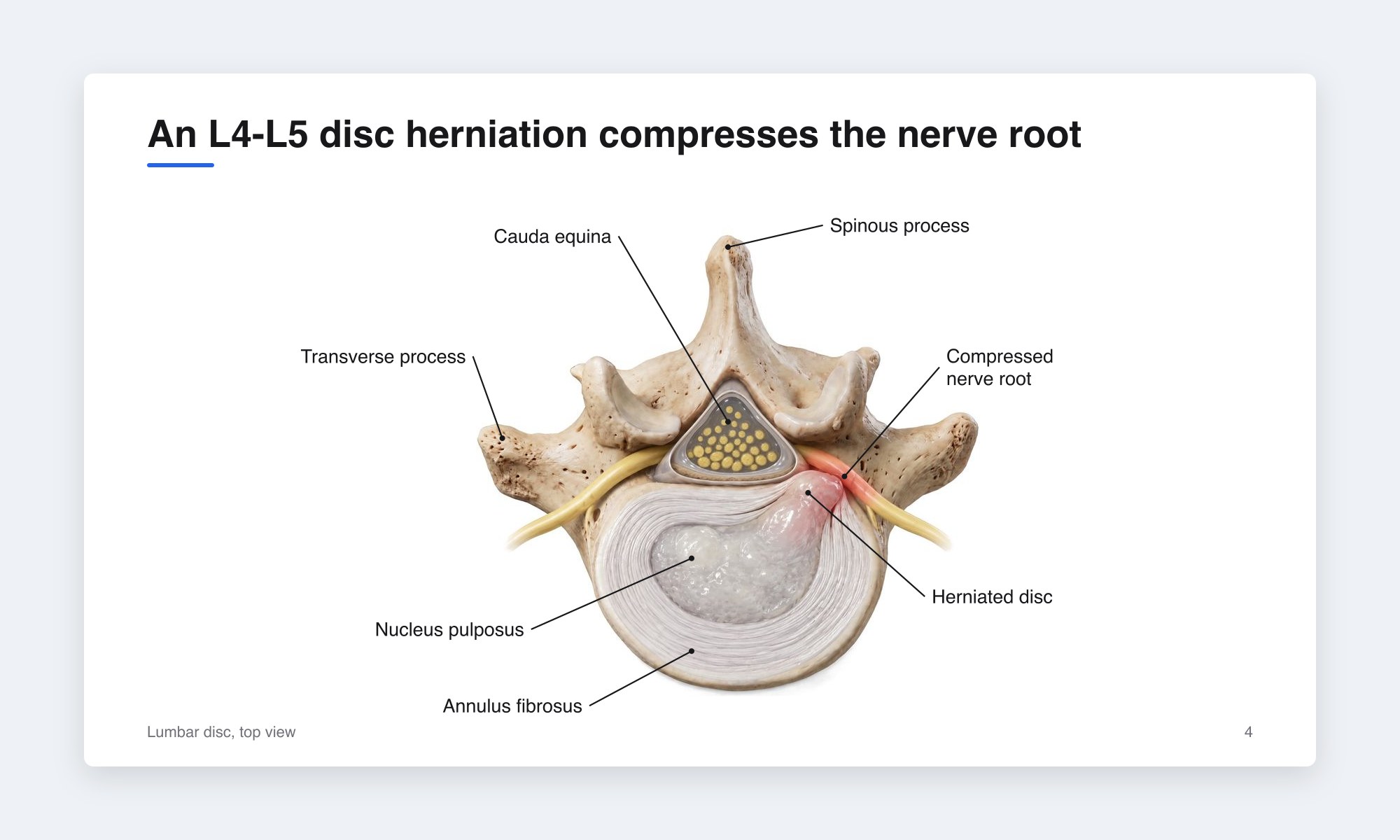 Example medical presentation slide with a sentence title, "An L4-L5 disc herniation compresses the nerve root," and one large labeled illustration of the lumbar disc from above.
This guide covers medical presentation slides for clinical audiences. If you are a physician chances are you've created slides for case presentations, conferences, grand rounds, staff meetings, or patient-facing talks. But have you ever wondered what makes a good slide deck? This article walks you through templates, the design rules that actually matter, and using medical illustrations.
Templates: Plain Beats Themed
The template that works:
- 16:9, the format of every projector and screen made in the last decade.
- Light background, dark text. White or a very light neutral. Dark decks look dramatic but photograph badly, wash out under room lighting, and make imaging harder to read next to them.
- One sans-serif typeface, such as Calibri, Arial, Helvetica, or Source Sans. Two weights at most.
- One accent color for emphasis and figure highlights. A hospital blue is fine. Avoid red as a default; keep red for pathology in figures.
- Wide margins and a consistent title position. Titles in the same place on every slide, figures aligned to the same grid.
- A minimal footer: slide number, and your name or the talk title if the deck will circulate. No logo on every slide unless the institution requires it.
If your department or hospital mandates a branded template, use it, and strip anything in it that crowds the content area. If not, start from a blank 16:9 deck.
The Design Rules That Matter
Presentation design advice is endless, but six rules carry most of the value.
1. One idea per slide. Keep the audience focused. If the slide has two ideas, make two slides.
2. Text is a caption, not a script. Keep it to a handful of short lines. You don't want to lose the audience by making them have to read long walls of text.
3. Big type. 24-point minimum for body text, 32 to 40 for titles, 18 minimum for figure labels. The back row is forty feet away.
4. Figures do the teaching. A labeled medical illustration, an annotated image, or a single chart. One per slide, as large as the slide allows, with the speaker's finger (or a laser) on the structure that matters.
5. Contrast and color discipline. Dark text on a light background, one accent color, and red reserved for pathology, arrows, and "look here."
6. Cite on the slide. Put a small reference line at the bottom of any slide with data or a borrowed figure.
Structuring a Clinical Deck
Clinical presentations share a skeleton regardless of length.
Title and disclosures. Name, role, date, and conflicts of interest. Required for CME-accredited talks and expected everywhere.
Objectives. Two or three, phrased as what the audience will be able to do. At least one should be clinically actionable.
The hook. A case, a question, an image, or a surprising number: the reason the room should listen.
The body, in sections matched to time. For a case presentation: presentation → workup → differential → diagnosis → management → outcome → teaching points.
For a topic review: background → evidence → application → controversies. For a research talk: question → methods → results → limitations → implications.
Summary. Key points to remember, on one slide.
Questions slide, with your contact details if you want follow-up.
Backup slides after the end (extra data, the full table, the second imaging series) for the questions you expect.
Budget roughly one slide per minute for didactic content, and fewer when figures are discussed at length. A 10-minute case is about 10 slides.
Medical Illustrations: The Core of Clinical Slides
Clinical teaching is spatial. Where the lesion sits, what the approach passes through, what the hardware replaced. The quality of the images often determines the quality of the talk since so much of medicine is visual.
Use one labeled figure per slide, large. A shoulder illustration with the rotator cuff labeled fills the slide, the title above states the point, and the speaker points. That is the most effective clinical slide there is.
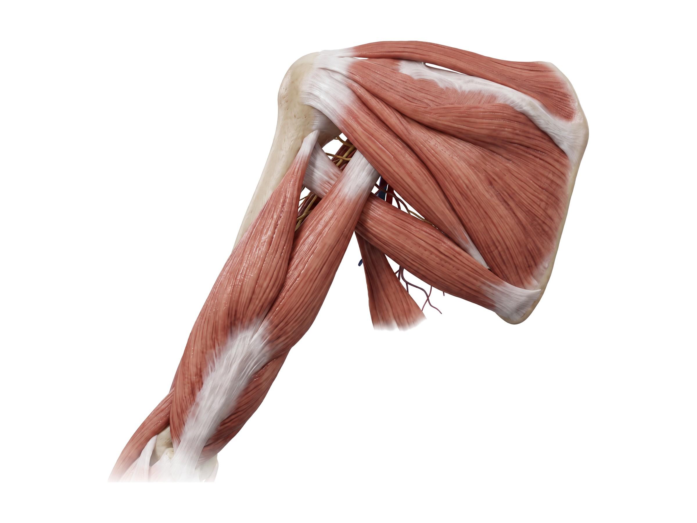
Label in the words you will say. If you say "kneecap" to a patient audience and "patella" to residents, the figure's labels should change to match. Mismatched labels cost comprehension.
Build in sequence when the point is a sequence. Use three slides (normal anatomy, the pathology, the repair), each from the same viewpoint with one change. Or use one slide with click-to-reveal layers. This is where slide animation earns its place.
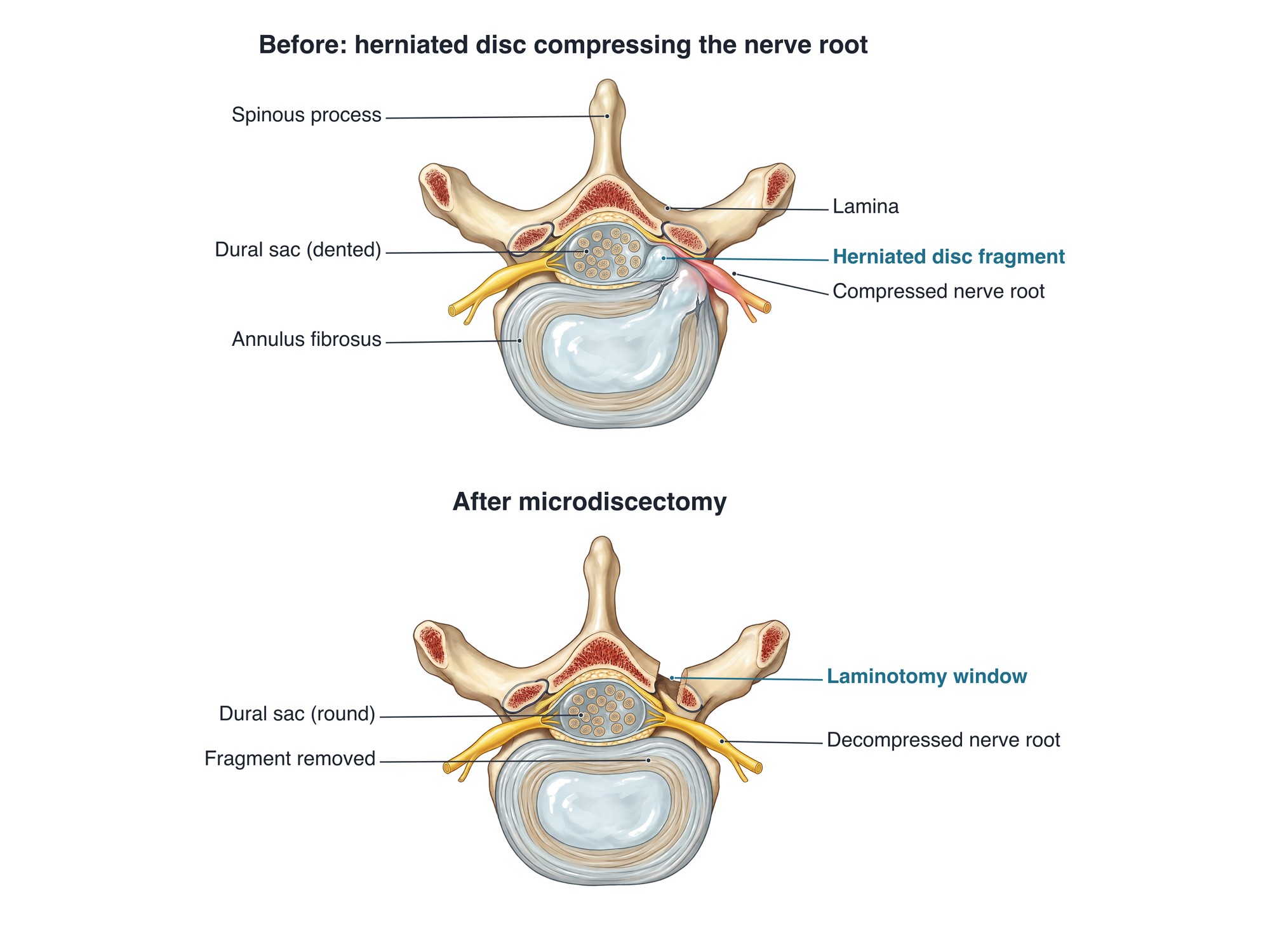 Microdiscectomy before and after, same cross-section of the lumbar spine: a herniated disc fragment compressing the nerve root, then the fragment removed through a small laminotomy window with the nerve root freed.
Where the figures come from, and the licensing problem. The textbook plate, the Netter image, the figure from a review article: all copyrighted. For a purely internal teaching conference, cited educational use is commonly tolerated, though policies differ by institution. The moment the talk is recorded, posted to a learning platform, delivered at a national meeting, packaged as CME, or reused in marketing, unlicensed images are infringement, and those are exactly the talks that get reused. The reliable path is to own the figures:
- Draw or commission them. A medical illustrator typically charges several hundred to a few thousand dollars per figure and takes days to complete.
- Use openly licensed medical illustrations with attribution, such as Servier Medical Art (CC BY) and Wikimedia Commons (mostly public domain, CC BY or CC BY-SA). Check each file's license: CC BY-SA means a figure you adapt must be shared under the same license.
- Generate them. Natomy turns a text prompt or a clinical image into a labeled medical illustration. You can apply your own stylistic flare to the illustrations.
Imaging and Clinical Photographs
Imaging. Export at full resolution, crop to the region, and annotate with an arrow or circle on the finding and a label. Show the pathology beside a normal comparison when the audience may not know what normal looks like.
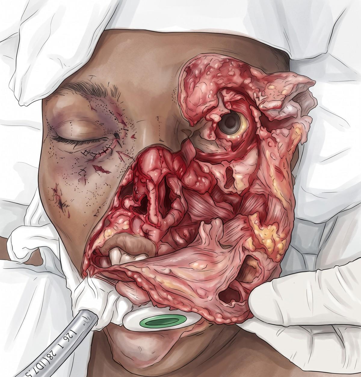
Clinical photographs require two things. The first is the patient's consent for educational use (most institutions have a form). The second is genuine de-identification by removing any HIPAA identifiers. When the identifying feature is the teaching point, such as a facial lesion or a distinctive scar, an illustration of the finding teaches the same thing without the problem. The facial degloving injury below was illustrated from a published case photo: the illustration shows every structure the audience needs without showing the patient (drag the slider to compare).

Video. Use short clips of a procedure or an examination finding, trimmed to the seconds that matter. Embed them rather than linking (conference Wi-Fi fails), and test them on the presentation machine.
Animation: When It Helps
Clinical animation, a short embedded clip of a mechanism, a physiological process, or a procedure, is different in kind. Ten seconds of a disc herniating under load or a screw trajectory through a pedicle teaches what a static figure cannot, and audiences remember it. Natomy generates short clinical animations from an illustration or an image; the medical animation guide covers the workflow. Keep clips under twenty seconds, silent, and looped, with the speaker narrating.
Delivery Details (For Important Presentations)
- Rehearse aloud with a timer. Cut the slides you skipped.
- Use presenter view on your screen, with only the slides on the projector. Notes are for you.
- Test on the room's machine. Fonts substitute, videos fail to embed, and 4:3 projectors still exist.
- Carry a PDF export as a fallback. It preserves the layout when PowerPoint does not.
- Face the room, not the screen.
- Pause on figures. Give the audience some breathing room to process the images.
Slide Template
A structure for a 10 to 12 minute clinical case or topic presentation. Scale it up for longer talks.
Download the free template. The deck below follows every rule in this guide: 16:9, white background, Calibri, one accent color, sentence titles, 24-point body text and 18-point labels. It walks through the 12-slide structure as a worked example (an L4-L5 disc herniation case), with labeled medical illustrations you can reuse with the citation on the slide. The labels are ordinary text boxes, so you can edit or move them, and the speaker notes explain each slide. It opens in PowerPoint, Keynote and Google Slides.
Download the template (.pptx, 14 slides)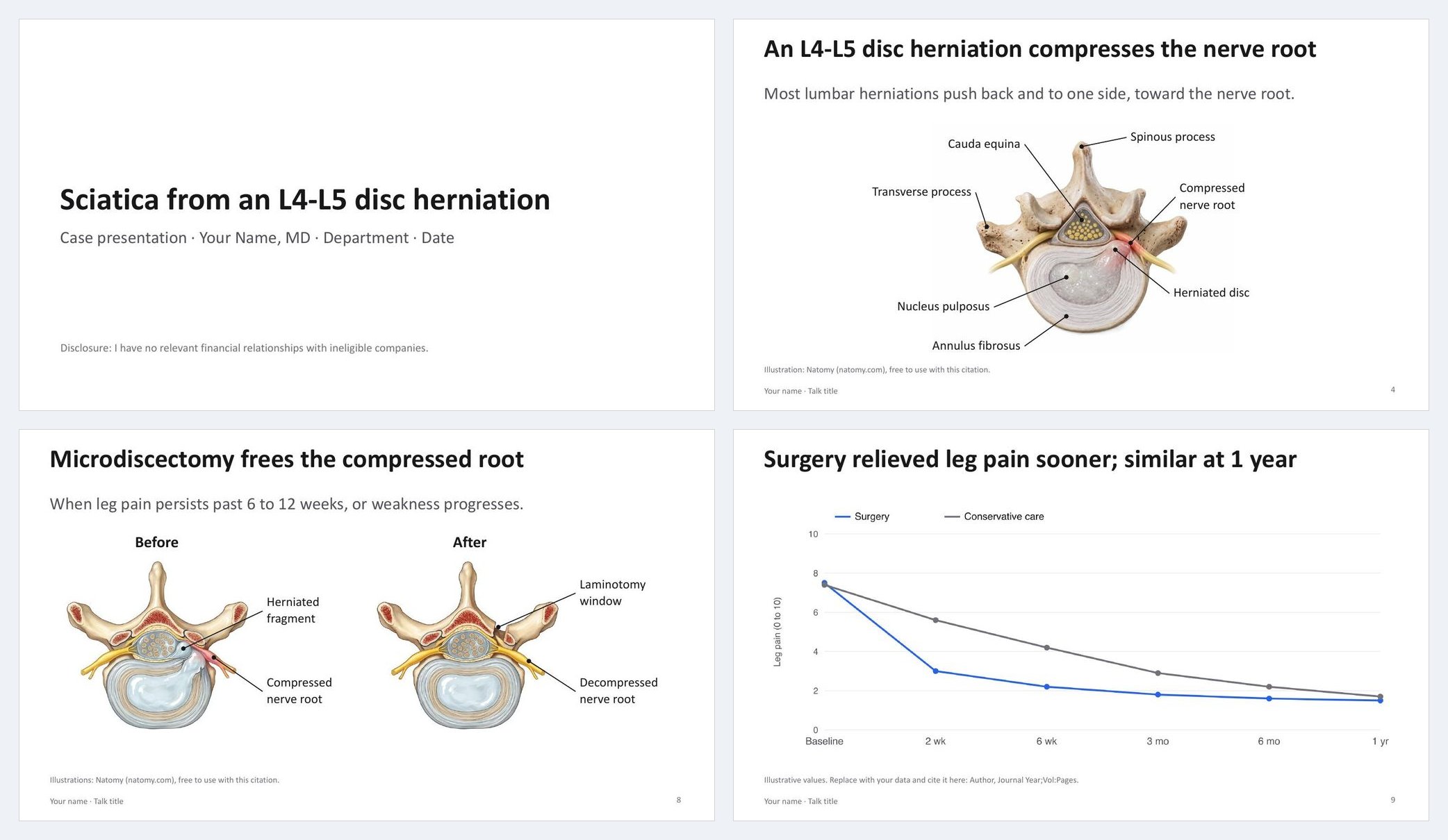 Four slides from the free medical presentation template: the title slide, a labeled lumbar disc herniation illustration, before and after microdiscectomy, and an evidence chart.
The structure, slide by slide:
 1  Title · presenter · role · date · disclosures
 2  Objectives (2–3, actionable)
 3  Hook: the case, image, or question
 4  Background: one labeled medical illustration, one sentence
 5  Presentation / workup: key findings, one annotated image
 6  Differential: build one line at a time
 7  Diagnosis: the finding, labeled, beside normal
 8  Management: procedure or plan; step figure or short clip
 9  Evidence: one chart or the key numbers, cited
10  Outcome / pitfalls
11  Summary: three take-home points
12  Questions · contact
    Backup slides
Every slide: a sentence title, no more than 5 short lines or one figure, 24-point minimum, a citation line where needed, and PHI checked.
A Working Checklist
- 16:9, light background, one typeface, one accent color; institutional template if required.
- One idea per slide; sentence titles; text as captions.
- 24-point minimum body, 18-point minimum labels; good contrast and color-blind safe.
- One large labeled figure per anatomy slide; labels match spoken vocabulary.
- Every figure owned, licensed, or openly licensed with attribution.
- Imaging cropped, annotated, and PHI-free; clinical photos consented and de-identified.
- Builds only where sequence matters; no transitions; clinical animation clips under 20 seconds, embedded and tested.
- Citations on data slides; disclosures up front.
- Rehearsed with a timer; PDF fallback; tested on the room's machine.
Hopefully you find this guide helpful and wishing you tons of luck on your next presentation.
FAQ
What is the best template for medical presentation slides?+
The best template is a plain one: white or very light background, one sans-serif typeface, a single accent color, 16:9 format, wide margins, and no decorative graphics. Many hospitals and departments supply a branded template; use it if required. If not, start from a blank 16:9 deck rather than a themed medical template. Most 'medical PPT templates' add clutter that competes with the content.
Is there a free medical PowerPoint template?+
Yes. Natomy's free medical presentation template is a 14-slide 16:9 PowerPoint deck built on the structure in this guide: title and disclosures, objectives, a case hook, a labeled medical illustration, workup, differential, diagnosis beside normal, management, evidence, outcome, summary, questions and backup slides. It uses a plain white design with one accent color and large type, and it opens in PowerPoint, Keynote and Google Slides.
How many slides should a medical presentation have?+
Plan roughly one slide per minute of talk for a didactic presentation (about 10 slides for a 10-minute case, 40 to 50 for a grand rounds hour), and fewer if slides are image-heavy and discussed at length. The constraint is not the count but the time each slide is on screen. A slide that is up for less than 15 seconds is usually one the audience did not need.
Can I use images from Google or textbooks in my medical slides?+
For an internal teaching talk, educational fair use often covers a cited image, though institutions vary. For any presentation that is recorded, posted online, delivered at a conference, sold as CME, or used for marketing, textbook and web images are copyrighted and require a license. The safe practice everywhere is to use images you own or generated, licensed stock, or openly licensed medical illustrations with attribution.
How do I use clinical photos in a presentation without violating HIPAA?+
Obtain the patient's written consent for educational use, remove all 18 HIPAA identifiers including faces, tattoos, and jewelry, strip metadata from the file, avoid combinations of details that could identify the patient, and never show imaging with the name or MRN visible. When identifiable features are essential to the teaching point, an illustration of the finding avoids the problem entirely.
What font size should medical slides use?+
Body text no smaller than 24 point and headings 32 to 40 point on a 16:9 slide; labels on figures no smaller than 18 point. If text will not fit at 24 point, there is too much text for the slide. Sans-serif faces (Calibri, Arial, Helvetica, Source Sans) read best on screen.
Should medical slides have animations?+
Only to reveal information in sequence (building a differential one line at a time, stepping through a surgical procedure, showing before and after), never as decoration. Slide transitions and moving text cost credibility. A short embedded clinical animation of a mechanism or procedure, by contrast, can teach in ten seconds what a static figure cannot.
Ready to create your own medical illustrations?
Upload a clinical photo and generate a professional illustration in seconds.
Try Natomy →